Only three months after the arrival in France of Meizu M1 Note, now his brother finds a place alongside him in the manufacturer’s shop. Unlike its predecessor, the M2 Note nevertheless the luxury of being compatible with two of the three French bands 4G frequencies, explaining the way its rapid arrival in France. The transition from one to the other-it’s worth so far?
Technical
| Model | Note Meizu M2 |
|---|---|
| Version | Android 5.1 + Lollipop FlymeOS 4.5 |
| Display Type | IGZO |
| Screen Size | 5.5 inches |
| Display resolution | 1080 x 1920 pixels |
| Screen Resolution | 401 dpi |
| Scratch-resistant coating | n |
| SoC | MediaTek MT6753 |
| CPU | 8 Cortex-A53 @ 1.3GHz (64-bit) |
| GPU | Mali-T720 MP3 @ 450 MHz |
| RAM | 2 GB 800 MHz LPDDR3 |
| Internal memory | 16 or 32 GB eMMC |
| External Memory | microSD (up to 128GB) to SIM slot |
| Device dorsal photo | 13 Megapixels (CMOS Samsung) f / 2.2 Double LED flash |
| Video | Full HD 1080p @ 30 FPS |
| Front camera | 5 megapixels f / 2.2 |
| Battery | 3100 mAh |
| Sensors | Sensor Hall effect sensor gravity touch sensor > Infrared Proximity Sensor Gyroscope Ambient light sensor Digital Compass |
| Fingerprint Reader | No |
| 4G LTE | 1800/2600 MHz |
| Wireless | 802.11 a / b / g / n 5 GHz – 2.4 GHz |
| Bluetooth | 4.0 |
| NFC | No |
| GPS | A-GPS + GLONASS |
| USB | micro USB 2.0 |
| SIM | nano-SIM Dual |
| Dimensions | 150.9 x 75.2 x 8.7 mm |
| weight | 149 grams |
| DAS | 0.258 W / Kg |
| Price | € 199 |
Overall, the data sheet of the M2 rating is not very different from the M1 Note, with its main difference SoC with a modem compatible with the French 4G frequencies. In terms of its other features, we find the foundations of the previous mid-range, with a full HD 5.5 inch, 2GB of RAM and an almost equivalent battery. In the transition, Meizu has updated the firmware that goes Android 5.1 to Android 4.4.4 KitKat Lollipop, and with FlymeOS interface 4.5 instead of 4.0.
We take the same and start again
Aesthetically speaking, the M2 rating is not much more inspired than its data sheet, since it takes again the appearance of his big brother out some months earlier. In truth, apart from some subtle details like the height of the volume buttons and the position of the power button, the two phones are almost indistinguishable from each other, taking certain items on the iPhone 5c. Back at least since façade, M2 Note now sports a true oval physical button encircled by a metal casing, similar to what can be found on Samsung smartphones.
This button is also the centerpiece of the M2 rating, as the usual two buttons (back and multitasking) have been removed. The first is replaced by a swipe of home button while multitasking is now managed by software by sliding his finger from the bottom end of the screen.
With its iPhone look more 5c large, the M2 rating is not trying to impersonate an upscale and fully assumes its pricing. The glossy plastic does not crack when pressed, but the setting of the display is poor as it is possible to spend his nail between the slab and the shell, and slightly deform the latter. Despite this, the rest of the finishes is of satisfactory quality and all seems pretty solid, which is good knowing that the shell is very slippery. This same defect makes the rest very risky each of the necessary gymnastics to position his finger on one of three physical buttons (power and volume two), all positioned on the left edge of the unit.
The most unpleasant point of this brilliant aesthetic is its tendency to get dirty. Most maniacs risk losing many minutes of their lives to dust off this white shell that perfectly catches the dust, and a cloth on this screen that marks a magnificent clear impression every action performed fingertip.
An exceptional screen
If you had to choose only one good point for this M2 rating, it would undoubtedly its screen. With 401 pixels per inch, it does not beat the record in this matter, but retains more than enough resolution for a pleasant everyday use. The Full HD videos are beautiful and the icons do not pixellisent is the point. Where the M2 rating is impressive, it is more in its brightness. With 640 cd / m², it is one of the brighter screens, making it possible to use it without penalty in any conditions, even in direct sunlight. A feat that is explained by its IGZO technology, letting more light in nature.
Besides the good point, the screen M2 rating is also right in its colorimetry, with bright whites and blacks almost as deep as the AMOLED (almost!). Between these two extremes, the rest of the spectrum was as qualitative, both in gray in color. Finally, while viewing angles are wide, allowing more comfort to enjoy the particular video.
Best of all, an option in the settings to adjust the colorimetry to his liking by moving a cursor “hot” to “cold”
Software:. total defeat
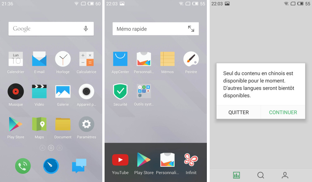
Meizu, as usual, uses his FlymeOS interface. While this may ease the transition for those just iOS because of its similarities with Apple’s system Android fans may feel lost. The first confusing is the lack of application drawer. Those who love multiply downloads so may find themselves quickly with many icons on their desktop to be classified in the files if they wish to maintain some order on their screen.
Besides these, and Multitasking to iPhone look, the more disturbing is certainly the location of the interface. While most texts are in French, some are still in English or Chinese. Worse, some seem to have been translated using Google Translate, resulting in a polyglot gloubiboulga incomprehensible. Finally, virtual shops préembarquées, whether the AppCenter or Customizing center, only offer content in Chinese, greatly reducing their interest. In addition, it is impossible to remove the personalization center, which will occupy unnecessarily (except for those who read the Chinese in the text) of space on your desktop.

Between Android and iOS
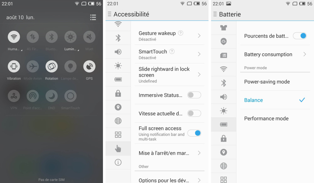
Some good ideas come luckily save a little all by providing a welcome ergonomics. Without preference, so we can quote the SmartTouch, which appears in all circumstances to a small transparent screen button that allows many interactions (back to the Home screen, open the notifications panel …), the DoubleTap to wake the screen, the Slide Up to unlock it directly from the previous day, or customization of the keyboard, certainly well thought out. Writing is also itself very effective once adopted hand.
This does not, however, sufficient to counteract the many problems, even forgetting the incompatibility of some applications such as Google Play Games. Note that those who have the habit of using mobile Chrome will think off processing tasks tabs since multitasking FlymeOS does not take into account and displays only one icon for Chrome, regardless the number of open tabs, one of the many constraints of this phone. In another, one of the two copies tested met many software problems. If this was certainly due to a malfunction during the installation of an update, this leaves us skeptical about the overall stability of the system.

All menus are not translated …
Performance: no surprises
On paper, the M2 is rather Note well equipped. With its octa-core processor MediaTek MT6753 features 8 Cortex-A53 cores and 2 GB of RAM, it appears in the benchmarks performance similar to what one would expect from a Snapdragon 610, or slightly better. We unfortunately can not be said of its GPU (Mali-T720 an MP3), which always gets lower scores that may propose an Adreno 405. Thus, if it is doing a lot when s’ This crude calculation, display and games are not his forte.
| Benchmark / Model | Note Meizu M2 | BQ Aquaris M5 | Alcatel One Touch Idol 3 (5.5-inch) | Archos 50 Diamond | Sony Xperia M4 Aqua |
|---|---|---|---|---|---|
| Screen Resolution | 1080P | 1080p | 1080p | 1080p | 720p |
| AnTuTu 5.x | 31580 items | 32 380 items | 29323 items | 30023 items | 30535 items |
| PCMark | 3491 Points | 3313 items | 3387 items | 3173 Points | 3401 items |
| 3DMark Ice Storm Unlimited | 6034 items | 7940 items | 7530 items | 7948 items | 6737 items |
| GFXBench T-Rex (onscreen / offscreen) | 11/12 FPS | 15/15 FPS | 12.9 / 13.7 FPS | 15/15 FPS | 10.5 / 18.6 FPS |
| GFXBench Manhattan (onscreen / offscreen) | 4.2 / 4.2 FPS | 5.7 / 5.8 FPS | 5.7 / 6 FPS | 5 8 / 5.9 FPS | 4.6 / 9.9 FPS |
This difference, though relatively small, is greatly felt in the most demanding games. If we did not have any problem on Rayman Fiesta Run and Dead Trigger 2, our experience on Real Racing 3 was plagued by untimely closures on Asphalt 8, low and erratic framerate got the better of my will after only two races. Side of Modern Combat also 5, fluidity is not at the rendezvous, suggesting that the problem could be a lack of optimization of Gameloft games for MediaTek processors. Therefore difficult to guarantee that any game can be appreciated on this M2 rating, although it still manages to get by fine on most of them.
In the Overall, the daily navigation is itself fluid. Only certain applications require a small loading time to launch, as the camera, but it is quite acceptable to the extent that it never exceeds 4 or 5 seconds. These are some slowdowns nevertheless more accountable to the applications themselves that system.
The sound quality of the speaker is rather disappointing. While the volume is sufficient (and yet, when nearly full), but the sound resonates in the plastic shell, making the cavernous and sizzling. A tip, plan a pair of headphones if you want to listen something with that M2 Note!
Network
In terms of communications, the M2 Note presents no particular problem. The sound is okay, both in transmission and reception, and ambient mics will help eliminate surrounding noise. Regarding 4G however, the M2 rating is compatible with the frequencies 1800 and 2600 MHz, but not with those in the 800 MHz band, which more easily in between buildings. While overall this should not be a problem in well-covered areas, some may feel this lack. Even in Paris, we happened to find ourselves 3G or H +, an unpleasant surprise in 2015 …
The GPS is on the correct him and puts between 5 to 10 seconds (outdoor) and 1 minute (indoor) to bind with rather good accuracy. Similarly, the compass of our copy was well calibrated and did not play us bad turn.
Photography
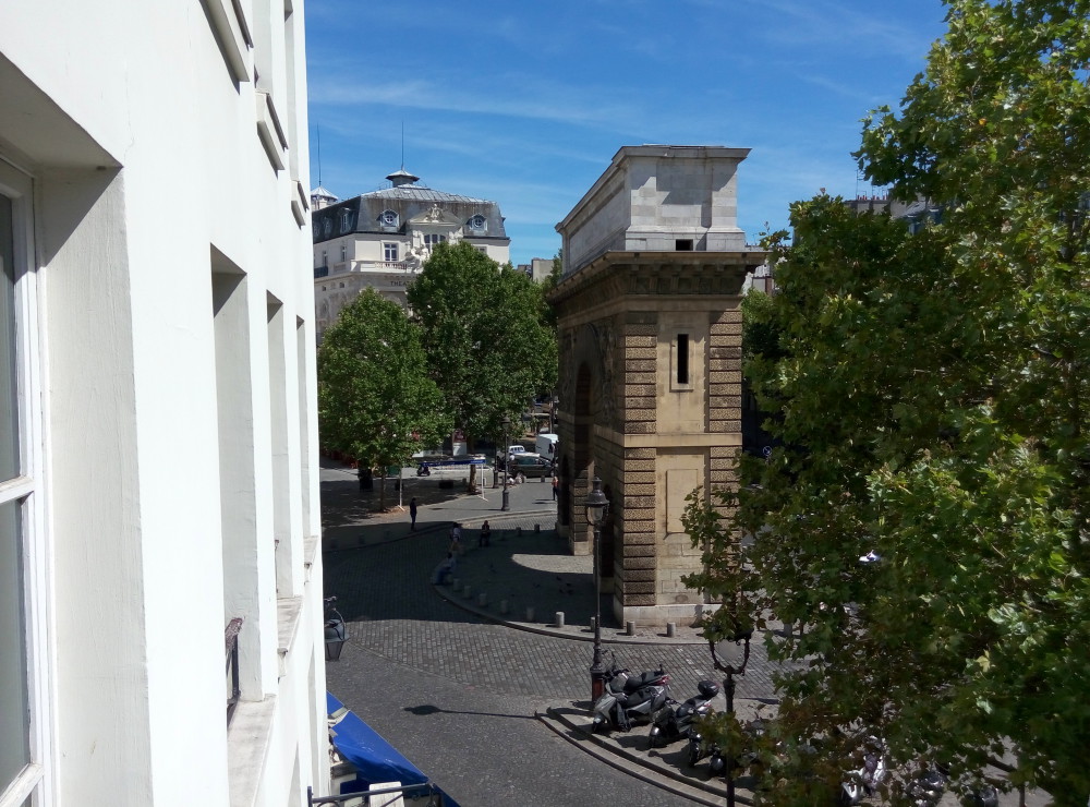
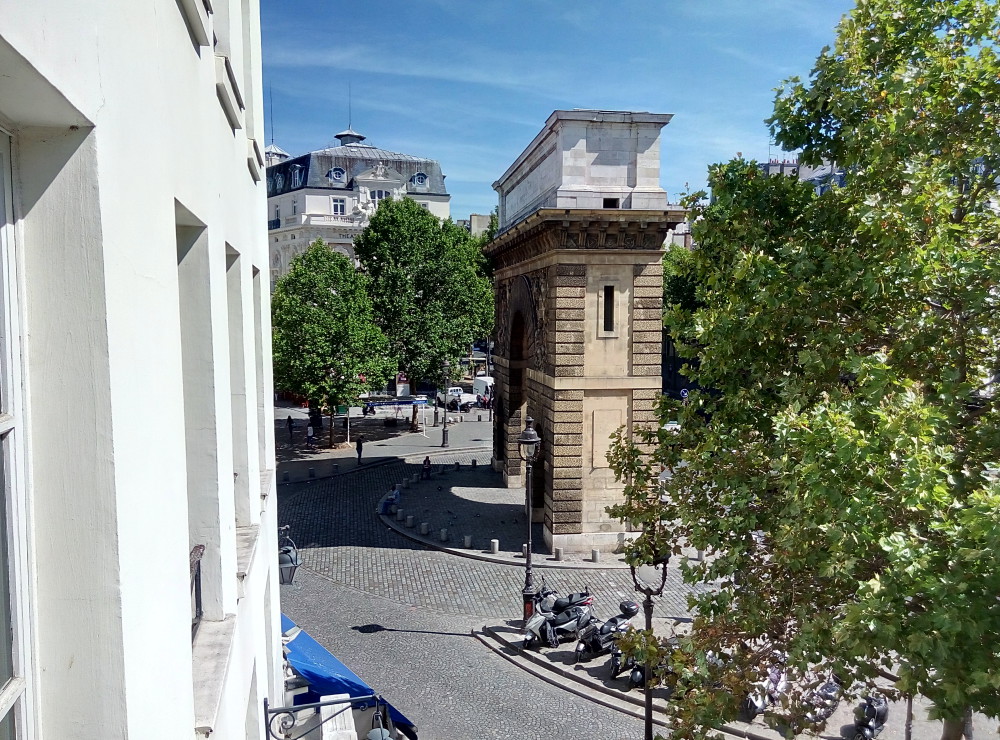
With a 13 Megapixel sensor from Samsung, we were able to wait a good quality pictures of the Meizu M2 rating, and actually, sharpness is not bad, as the record is overall satisfying, without being exceptional. The colors are also quite loyal, and the contrast is pronounced enough not to flatten the image. Sometimes, however, the unit has a little trouble precisely adjust the contrast, resulting in clogged areas, or on the contrary inadequately marked boundaries on smooth surfaces. Even indoors, as long as the light is present, the report is correct, although it greatly loses quality in really difficult conditions. But it would be dishonest to blame him given the price of the phone.
The photo application is itself quite complete, with different modes (Panorama, Beauty, Slow … and even a manual mode) Instagram filters. When you want to return to the menu, however, location problems are worse than ever and often require a long time to think before understanding the interest of each option. In addition, the HDR mode might be more accessible, especially as it solves some contrast problems.

In normal …

… and HDR.
Run
With a battery of 3100 mAh, the M2 rating should in theory provide a good autonomy. Yet, during our usual test of watching a YouTube video (1080p) 1 hour WiFi with the screen brightness set to 200 cd / m2, its battery is discharged by 15%, which is a mediocre score. In use, this is confirmed. Although it holds the day, a daily refill still required. For the sweet tooth, it nevertheless offers three power modes, the “Performance” mode to take full advantage of available resources, the “Power-saving” mode to ensure a long day of use, as well as a fashion “Balance” between.
No comments:
Post a Comment